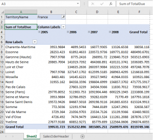
Congratulations, you created your first Business Intelligence report using nothing but Excel! You have a nice data query to quickly pull in information from SQL and you have a Pivot Table for a quick, no formula summary and search. Now you are ready to do a bit of Pivot Table Cleanup. Cleanup? Ugh!
 Hey, I’m not asking you to pick up your bedroom (unless you’re one of my kids, then I really am). I’m suggesting you add a bit of polish to your report so it is easier to read and has a better presentation. You’re thinking “but I already have the results”, right? Yes, but are they perceived as accurate and useable? I would say… maybe not!
We already solved one problem by using Excel. You, or your users if you are in IT, will now have a tool people are willing to use. With just a few minutes of Pivot Table Cleanup, you can make the report stand out! Every bit of polish helps. Remember, you want your report to be perceived as elegant, accurate and professional. If your report looks quick and sloppy, the results are not trusted the same. This is no different than making sure you look great at the office or a date… perception and presentation matter.
I’m going to run through a check list of items, and hopefully you can do these with your basic excel skills.
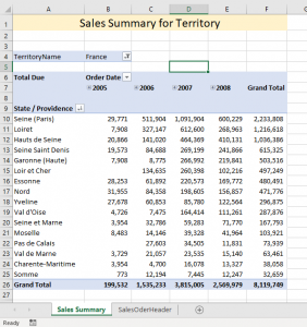
 Make the numbers look like real sales figures. Right click over one of the sales figures, then click “Value Field Settings”. From there click “Number Format”, then you’ll see a regular format window. Select “Accounting” with no dollar symbol and 2 or 0 decimal places. I find for high level management reports, no decimals looks best.
- Update the default column headings. Change “Row headings” to “State / Providence”. Change “Column Labels” to “Order Date”. Finally, change “Sum of TotalDue” to “Total Due”. This can be done by simply editing straight into the Pivot Table cell.
- Sort the results with the top performing location coming to the top. Right-click over any state name, then “Sort” and “More sort options”. Select “Descending” and “Total Due” to get your highest producer at the top.
- Add a heading line that is centered and “merged” across the top. Something like “Sales Summary for Territory”. Make it bigger and with a light color background.
- Change the name of the tab from “sheet 2” to “Sales Summary” or something else that is meaningful.
- Anticipate your report will be printed. You need to make sure the page will be “centered” horizontally, has a footer with spreadsheet name, page number and date, and will repeat the top row.
Notice the difference? Now you can add a Graph and Show Results!


