Well, if you didn’t just skip to the end, you should have a nice report by now, straight from SQL displaying very nicely in a Pivot Table. We can add a Graph and Show Results, proving that a picture is worth a thousand words!
 We need to add a place in spreadsheet to show the graph, and we typically like to have the graph at the top. When a graph is at the top, it seems to have the biggest impact on the reader. Also, it’s a bit easier for varied sized lists to look good. To start the graph, you need to select a cell anywhere within the pivot table. When you are in the Pivot Table, you will see the special ribbon for “Pivot Table Tools”.
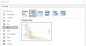
 Click “Analyze” then “Pivot Chart”. Tons of options here, so let’s start simple. Let me suggest using the Stacked Bar. With the stacked bar, you will be able to see your best performers and “stack” the years together. If you use a standard bar graph, the years are side by side and the results are much harder to read. You can also try a stacked column. Move and size the graph to fit the space you opened up earlier.
You can use the defaults on the graph, but we like to do a bit of cleanup first (surprise!). Here is a short bullet point list to do.

- Hide all field buttons on the chart. Since we include the Pivot Table data with its various pull downs, the chart does not need those same details. We would rather have the space for useable information. Right click any of the buttons then click “Hide all field buttons on chart”.
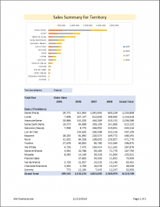
- Have the highest performers at the top, to match the Pivot Data. The default (for some crazy reason) is the opposite of the Pivot Table. Click the graph column of state / provinces, then right click to “Format Axis” and new options are will display. Click “Categories in reverse order”.
- Play with the report a bit. Tweak formating or sorts as you see fit. Change the territory in the Pivot table and you’ll see the graph automatically update… cool, right?
If you followed along from the beginning of Excel for SQL Business Intelligence, you should have a meaningful piece of information you can proudly show your boss.
To finish out, click the print preview and you should have something that looks like our final picture. Not the nice headings and footings. Note how everything is well centered. This looks like you put a lot of time into making sure the information was useful, and it is! You started from nothing, with no expensive tools, just a little it of knowledge… and look what you did!
Like what you read? Do you prefer immediate help?
CALL NOW – 954.729.8455 or contact us through e-mail by clicking 3Deers.com


